C&G Certificate Module 5, Chapter 12 - Stitch Trial Samples - Using Extreme Contrasts

SKETCH BOOK


Page 97


Top left: Buttons covered in moulding paste and painted with bronze metallic paint (relief interpretation)

Top right: Bias binding strips folded into circles, background stitched with running stitch.

Bottom left: Circles stitched in buttonhole stitch. Pelmet vilene dyed in various strengths of tea, cut and marked with a soldering iron.

Bottom right: Tyvek painted with bronze metallic paint and heated with a heat gun. 


Page 98
Top left: Tissue paper, painted with acrylic paint, (relief interpretation).

Top right: Turkey stitch on calico. After cutting loops, acrylic wax was lightly painted over stitch to reduce fluffiness and increase texture.

Bottom left: Layers of organza, gathered and stitched down.

Bottom right: Copper fabric pleated with smocking pleater, using copper thread, arranged on organza, which was loosely smocked with copper thread.


Page 99

Top left: Shredded paper, arranged and painted with bronze metallic paint, (relief interpretation).

Top right: Calico, machine stitched with short, crescent-shaped pleats.

Bottom left: Six layers of synthetic organza fused together, then cut into thin strips and arranged.

Bottom right: Bullion stitch using 4 and 2 threads. Number of wraps between 12 and 25.


Page 100
I decided to work from this design as I liked the distortion (page 95) and felt the shapes had great potential.


Page 101
 I worked through several sketches, incorporating different levels into the design.


Page 102
I tried out creating curves, but didn't feel that it was dramatic or extreme enough, the design was too close to my comfort zone!


Page 103
Experimentation by turning the design round, still not there yet!


Page 104
I took one shape (bottom left in design above) from the original distorted picture and placed it around the page until I came up with this design. I like the shapes created very much. With the theme of landscape, at first it reminded me of the gaps between crazy paving. After more thought I decided it could be water flowing around rocks.


Page 105
Next I went back to my colour scheme and painted a piece of pelmet vilene in yellow ochre acrylic paint. I was not very impressed. Recently our branch of the EG had a workshop in ecoprinting. Although I hadn't been able to attend, everyone was talking about it at our last meeting. This gave me an idea. I have two plants in the garden at the moment that are in their full autumn colours, so I collected some leaves from the burning bush and staghorn sumach. I was hoping for colours similar to the pressed leaves shown above. The prints were very dark with more of a mauve/purple tinge than gold/brown. The printed patterns were lovely but the remaining fabric was quite pale so I made some strong tea and dabbed the lighter areas with it. The resulting fabrics look dark and smokey - a very big departure from the sunny colours I usually choose. I took a big gulp and carried on!


Page 106

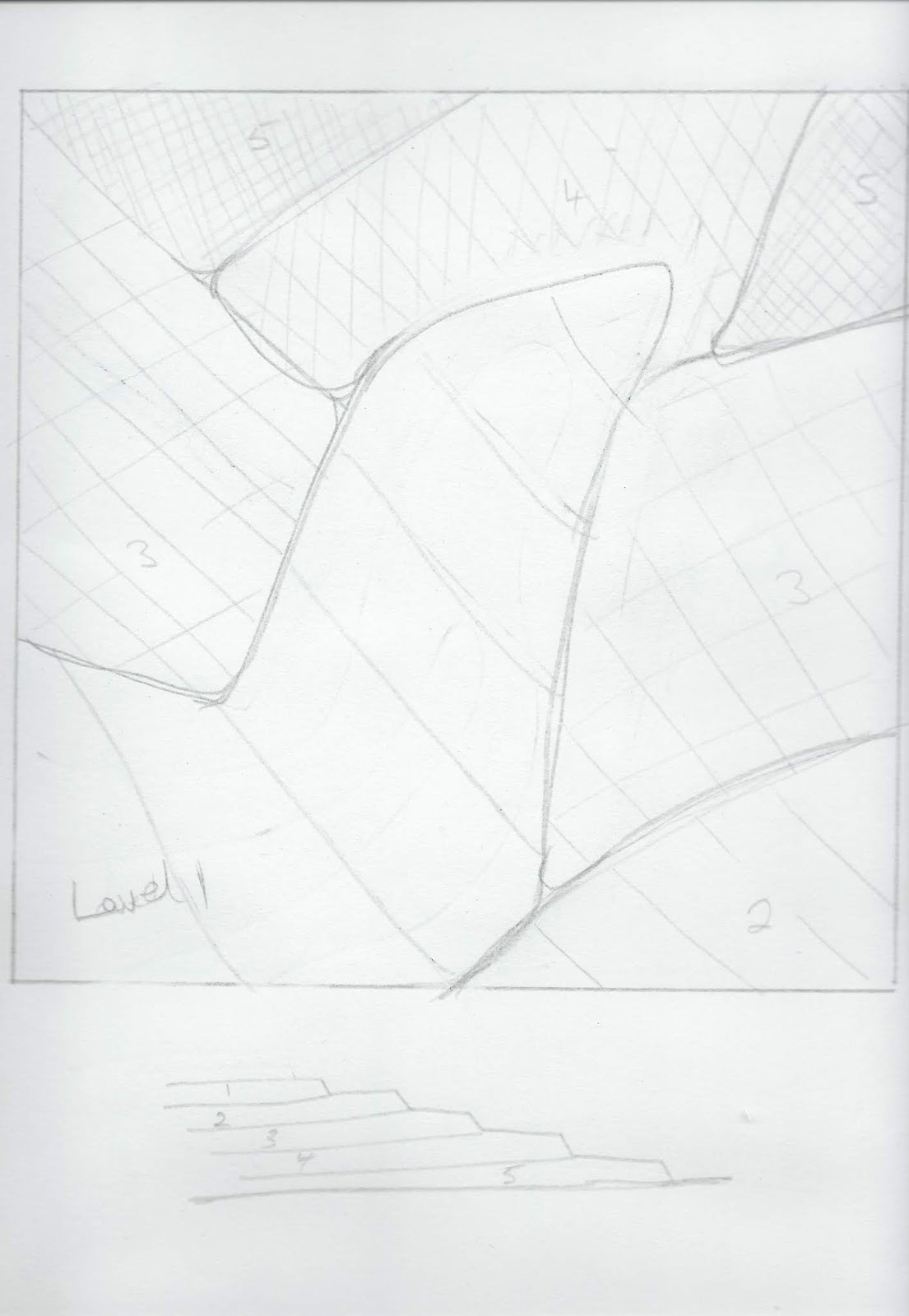
I wanted to create a contrast  between the four raised corners, which are padded and manipulated into shape with the low lying central section. Having used acetate in chapter 11,  I realised how much an acetate surface would contrast with the 'hilly' corner sections. At first I laid a shaped piece of acetate in the centre to represent the smooth surface of water, however it was very difficult to sew it in place so that it appeared completely flat. An idea came to me to solve this problem when I was spraying water onto bath bubbles, ie cleaning the bath! The water from the spray made round holes in the bubbles. This prompted me to cut circles in the acetate. It made the acetate much easier to sew in position and also made the smooth surface of the 'water' much more realistic. I built up layers of cut vilene circles below and above the acetate to add extra interest. All the circle shapes in the central section contrast with the raised 'jagged' corners.


Page 107
 My resolved sample measures 20 cms square and is mounted in a black 30 cms square frame. I am very pleased with how it has turned out. I  have kept the stitches and fabric manipulation simple and hopefully the contrasts demonstrate the different areas of texture. A sense of depth has been created through the central section, by layering dark pelmet vilene as the base, through to lighter pelmet vilene on the top.


Page 108

Close-up section.