C&G Certificate Module 1, Chapter 3 - Design Development

I decided to start with the Maltese Cross, because I liked the shape, it is reasonably simple and not too difficult to draw, but it soon developed! Out of all the shapes I made in Design Sheet A, I liked the semi-circle best and it made a great repeat pattern.

I carried on with the Maltese Cross but it started to look rather cumbersome, especially when I enlarged it (page 19 (ii)), so I slimmed it down (page 17) and it developed into a more delicate shape. It turns the corner beautifully (page 19 (iii)).

I then developed the new cross by opening up the middle into a square and adding the Maltese Cross over the top, (page 18).

To help create an interlocking shape, I joined to open centred shapes together, (bottom of page 18) and used this on page 19 (vii). I really enjoyed working on Design Sheet B because I surprised myself with the shapes that developed.

With Design Sheet C, I re-worked a design that I created in Design Sheet B, but hadn't used. The counter-change exercise was quite difficult at first because I started by using tissue paper and found it very difficult with a craft knife, so gave up and changed to cartridge paper!

I had to cut the separated motif, page 21 (ii) into 8 pieces in order to pull it apart because of the angles of points.  The 'arrow' shape jumped out at me as the motif to use, although I re-sized it as the shapes were getting rather large.

I wanted to rotate the arrows as shown on page 20, but I couldn't get a satisfactory pattern to develop so went for something more simple (page 21 (v)). When I had finished all the designs, I went back to the rotational design and created it on page 22.

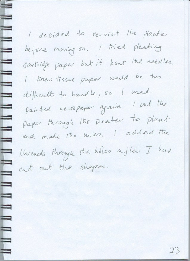
I wandered a bit by adding the pleated paper on page 20. I just wondered if it would hold the folds, and it did!

SKETCH BOOK


C&G Certificate Module 1, Chapter 2 - Coloured Papers

I have not used Brusho inks before, although I have heard of them, so I went to YouTube to watch a few tutorials.

I chose red and green as my complementary pair of colours. I was a little concerned that I might end up with every shade of brown when I mixed them together, but was delighted that this did not turn out to be the case!

I started by mixing 1 tablespoon of water to five 'shakes' of ink powder and this seemed to be a recipe I could repeat. 

I  used cartridge paper, newspaper, tissue paper and brown paper. Fortunately it was a sunny day, so I laid the wet papers out in the garden and they dried very quickly.

I decided to base my stamp on the lamb chops and cut a stamp out of foam (the way I've cut stamps before), but it was difficult to position it accurately on the paper, so I cut a smaller stamp out of rubber, which was much more manageable.
My first attempts at printing were rather blotchy and I sometimes left extra marks, using the foam stamp. The rubber stamp, being smaller was much easier to use. I was pleased with the results I have put in my sketchbook. As I was printing the design on page 11, I accidentally spilt some water on the bottom of the page and the ink started to fade. As this was the print using less acrylic paint down the page, after an initial panic, I sprayed more water on the lower part of the page and sponged it off with a kitchen towel, so that not only does the print fade, but so does the background colour. 


Next, I selected the shapes from my research and drew them into the back of my coloured paper with the aid of tracing paper and a light box.

I am not particularly neat, so I found the tracing and cutting required a great deal of concentration!


SKETCH BOOK


C&G Certificate Module 1, Chapter 1 - Research on Crosses

Rejects on the cutting room floor!
Getting started is always a bit daunting but after some thought I decided I would look at crosses and started my research on the internet and looking round my own environment.

I compiled quite a lot of images but then had to be selective. As I sorted through I realised that they were generally falling into two categories, 'Ancient' and 'Modern'.

I do not find drawing particularly easy but fortunately I have a light box and with the aid of tracing paper, I drew some of the images, first in pencil and then went over them in pen.

The next challenge was the colour circle. I have not used gouache paints before so I went to YouTube for a tutorial. I was amazed and delighted to discover how gouache paint works, spreading like a watercolour but with the control of an acrylic. I created a colour chart, testing out the paints before I started on the colour circle.


Fun with gouache!
SKETCH BOOK