Distant Stitch Diploma, Module 1, Module Summary


Sketchbook Cover inspired by Sea Urchins

Distant Stitch Diploma, Module 1, Chapter 13 - Study of Contemporary Textile Artists

The first textile artists I have chosen are Shelley Rhodes and Vanessa Barragao. They have both created work associated with my theme of coral reefs and have given me a lot to think about.


Page 174

Page 175


Distant Stitch Diploma, Module 1, Chapter 12 - Towards an Embroidered Item

I had been thinking about making my embroidered item well before I started this chapter. I have been interested in creating wearable art  ever since I made the espadrilles and beach shoes during my studies for the C&G Certificate. I have started this chapter with my idea and have worked the rest of the chapter towards it.

Page 158

Page 159


Page 160
A close up of the stitching. I have stitched on painted bondaweb before and not had any problems. This time, in the darker section at the bottom, the bondaweb is layered and overlapping. This caused problems with stitching as the glue stuck to the needle and clogged up the eye. Consequently the thread broke quite a few times, very frustrating. I didn't encounter any problems when adding the stitching to the lighter coloured bondaweb at the top of the sample, where I only had one layer of bondaweb.

Page 161
The finished A4 sized sample with the rosettes added. I liked it so much, I was reluctant to cut it into shapes!

Page 162

I applied tracing paper to the back of the felt and stitched from the back to create the initial shapes.

Page 163
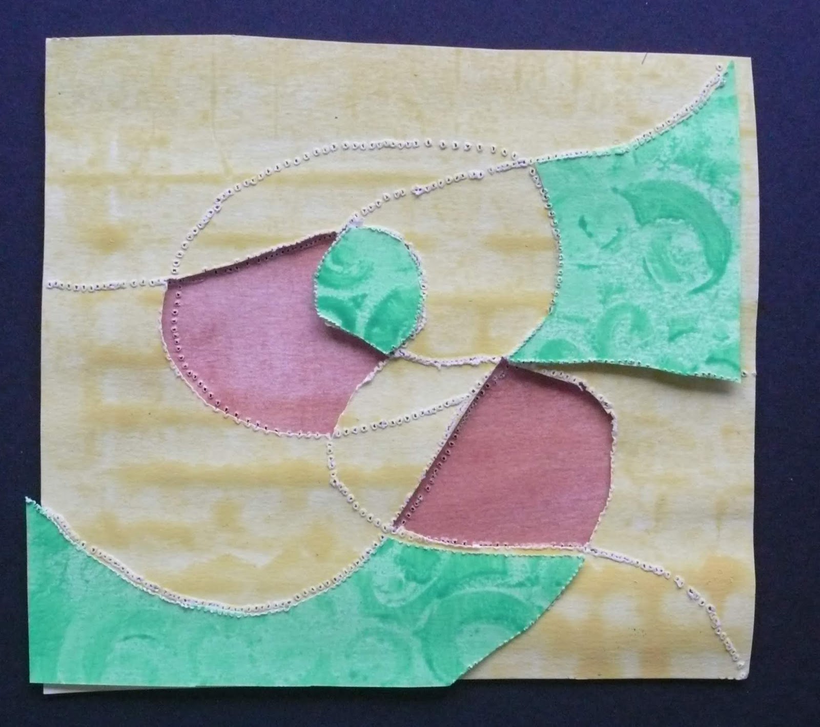
 A few arrangements. I love the combinations of colours and how the fragmented rosettes add texture.


Page 164


Page 165
All the designs are worth developing. However, next time I would like to work on finer fabrics, using a water soluble stabiliser such as Aquabond 2, rather than felt. I would then be able to create a much more delicate effect. I would still work in the same colours, perhaps developing more shapes, such as semi-circles, scallops and arcs.


Page 166
The basic shape of the shrug using a paper pattern. This can be adapted as ideas develop. I would want to use a basic pattern to make sure the finished garment is well proportioned.


Page 167
I have pinned the shapes onto the dummy to experiment with design. I love the colours, blues and turquoises are a strong feature of my theme. Perhaps the introduction of tiny golden and silver highlights would enhance the colours. The shapes need some refining but my concept at this stage is that there would be a border/edging all around the garment to hold it in shape.


Page 168
These are very early thoughts, as I don't yet know how my ideas will be shaped by Module 2.

To sum up, my proposal is to make a shrug, in a graduated colour scheme of blues and turquoises, darker colours at the bottom of the garment and lighter ones around the top. Possibly layers of fine fabrics, dyed or  silk painted, with added texture.

Texture would be added by creating stitched pieces on water soluble fabric and appliquéed onto the base fabric. Machine embroidery directly onto the fabric could also be included.

Page 169


Page 170

Page 171
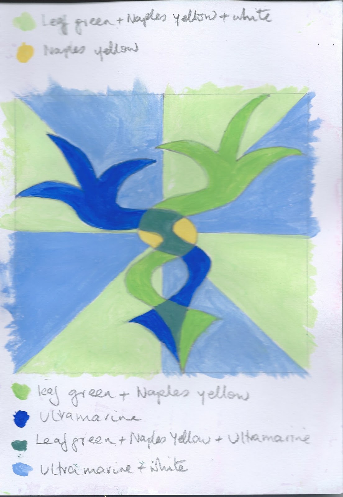
 More ideas, showing the flowing pattern from the embroidery on page 100a and 100b in chapter 7.


Page 172
These are early ideas and I will need to work on samples to see what works best.


Presentation board for Chapter 12

Page 173

I rotated the board to look at the design from a new angle, very pleased with the result!


Distant Stitch Diploma, Module 1, Chapter 11 - Bold Design Development


I went back to my heap and chose the ridges on the clam shell and the strong shape of the sea urchin spines for inspiration. I used a variety of brushes and wooden spatulas, daubed with  acrylic paint to create a series of bold marks.


Page 144
Ultramarine, coeruleum blue and turquoise paint with exaggerated curves inspired by the outside of a clam shell, (A4).

Page 145
Bold marks in yellow, pink and white acrylic paint, using wide brush, plastic spatula and fan brush (A4).


Page 146
A repeat pattern with bold lines on a softer background.


Page 147
Page 147 and 148 show tiles of colour that could be adapted to scallop shapes to represent overlapping fish scales.


Page 148


Page 149
Spikes of colour on a turbulent background.


Page 150
Rearranged section of bold shapes.


Page 151
Repeat pattern of swirling shapes (edge of clam shell) could represent eddies on the surface of the sea. Good potential for turning into an embroidery.


Page 152
Close up of bold lines with thin strips superimposed to add texture. Potential for an embroidery.

Page 153
I cut a piece from a glossy magazine to break up the pattern, not very successful.


Page 154
Rough waters surrounding a calm patch of sea. Not very inspiring.


Page 155
Bubbles rising from the depths. Shapes smaller and lighter in colour near the surface. Potential for further development.

Page 156
Choppy seas or pyramid stitching?

Page 157
Incorporating the magazine strips above has enhanced the design. I love the colours although the adjoining lines are abrupt. This problem could be softened with blended stitching.


I like the repeating swirls on page 151 and the bubbles on page 155 the best. I think both of these designs would work well in stitch and are very much in keeping with my theme.


Presentation board for Chapter 11


Distant Stitch Diploma Module 1, Chapter 8 - Design Exploration with Hollow Outline


Page 113

I chose one half of the clam shape, photographed from above, shown here in greyscale.


Page 114
I drew it several times, refining the shape until I had something that pleased me.


Page 115
Outlines drawn over each other.

Page 116


Page 117


Page 118

Working on the original shape I gradually enlarged it inconsistently to see what would develop.


Page 119


Adding patterns helped to show the development of the shape.


Page 120

I looked at the top and bottom of the shape and worked through a series of variations until I got to the bottom right design. I found this one very pleasing.


Page 121

I cut the new shape out in the coloured kitchen towel I had saved from chapter 6. The graduated colouring of the paper works very well with the twists and curves of the shapes.


Page 122
I redrew the curving shapes then painted them, using colours from my colour scheme.


Page 123
I created a mount to focus on the centre of the design.


Page 124
Design in landscape.


Page 125
Looking at the shapes in greyscale.

Page 126
I enlarged the centre of the design and drew the shapes in pencil.


Page 127
I then mirrored the shape and stitched through layers of coloured papers.


Page 128

Page 129

Page 130

Pages 128 - 130 show variations in shapes and colours. The number of combinations is endless so I limited myself to 4!

Page 131
I separated the shapes, selected similar shapes and stitched over them. Next I reassembled the pieces together and mounted them onto black stitched paper.


Page 132

Quite by accident, a faced appeared, so I pleated the 'hair' and stitched rows of vertical lines down the paper. I think this is more effective in only one colour.

I found it quite hard to get started on Edges as Lines. The stick man was very effective but I eventually found a couple of shapes that I feel work well.

Page 133
 I chose the shapes from the bottom left of page 131.

Page 134

Page 135

Page 136

Page 137

Page 138

Page 139

Page 140

Page 141

Page 142
 Me, concentrating!


Page 143
Setting some of the variations together produced an interesting piece that could be developed further in stitch.

This chapter was quite challenging. However, I was amazed that by starting with the side view of a clam shell I would end up with the collage above!

Presentation board for Chapter 8