Distant Stitch Diploma, Module 1, Chapter 7 - Colour and Texture in Stitch

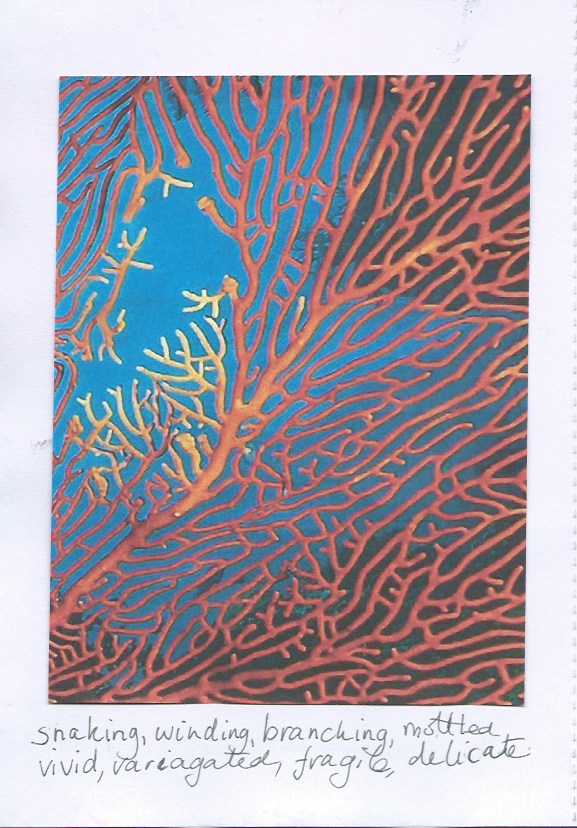
I chose 3 pictures to work from, a sea fan coral, an army of sea urchins and the spiral of a sea snail's shell. All the embroideries measure approximately 15cm x 15cm.
Page 94
 I chose this picture because I liked the intricacy of the pattern and the graduation of colours. I decided to layer hand stitch over machine embroidery. To emphasise the stronger branches of the sea fan, I created a separate piece of machine embroidery on soluble fabric, graduating the blend of colours through the veins.


Page 95
I looked for a pattern in the picture that would provide movement and flow. I drew my design on tracing paper.


Page 96
 On a second piece of tracing paper I added the branching stems/veins of the fan coral.


Page 97
 Using one of my dyed cotton drill pieces, I machine stitched the shapes onto the fabric.


Page 98
I overstitched with a variety of chain stitches in different sizes, changing the colour of my thread to match the colour of the fabric. Small pieces of gold fabric have been trapped under the hand stitching.
I used Supermend powder to stick them down, but it wasn't very successful and quite a few snippets drifted away!


Page 99
I created the stem on soluble fabric, following instructions in Meredith Woolnough's book, called Organic Embroidery. I used 2 shades of purple, light and dark, to create it. Although it is not too clear, the central part of the stem is lighter than the tips. I laid it onto my embroidery but felt that the stem stood too proud against the background.


Page 100
To soften things down, I laid a piece of black tuile over the piece and machine stitched more branches/veins into the embroidery. I edged the embroidery with cable zigzag.


Page 100a

I removed the black net and the dominant outline and restitched the branches in cable chain in darker threads, much better!


Page 100b

Close up of reworked embroidery.

Page 101
My second source of inspiration was this picture of sea urchins, which live on coral reefs and help to maintain the balance between coral and algae.


Page 102
 I looked for shapes within the picture and drew my first design onto tracing paper.


Page 103
On a second layer of tracing paper I drew the spines. The design has become more abstract than the sea fan coral design.


Page 104
I created a background on dyed cotton lawn by placing torn pieces of Bondaweb and snippets of threads together. I marked the circles on the fabric with a frixion pen and then arranged the darker pieces in the circles with the lighter snippets surrounding them. I then sprinkled the fabric with Supermend, laid a piece of black tuile over the top and ironed everything together.


Page 105
I machine stitched around the circles several times. Next I zigzagged round inside each circle. Then I added the spikes with long straight machine stitching. Afterwards I chose blanket stitch to emphasise the spikes. The machine and hand stitched spikes all intertwine to create an impression of sharpness and aggression.


Page 106
Close up.


I have added tufted 'urchins' to bring more texture to the stitching.


Page 107
 Looking for a softer, more gentle source of inspiration, I chose a simple spiral.


Page 108
As before I traced the design onto tracing paper, to help me build up the layers.


 I added another layer of more exaggerated shapes on a second piece of tracing paper.


Page 109
 I started machine zigzagging from the outside to the centre using the settings of 3, 5 and 7 for the stitch width.

Page 110
Over the zigzag stitch, I added rows of cable stitch and a raised layer of zigzag stitch with the help of my fringe foot.

Page 111


Page 112a
A few simple shapes, on a soft blue and pink background.


Page 112b
Hand stitching over machine stitch in pale blue thread and metallic, variegated pink thread.


Presentation Board for Chapter 7


Distant Stitch Diploma, Module 1, Chapter 6 - Colouring of Materials

I chose Option 1 and used Procion dyes.

For my colour trials, I used calico, faux silk, muslin, cotton drill and cotton lawn. All are natural fibres except for the faux silk. I have used faux silk in a lot of stitching and it handles like a natural fabric so although it is synthetic, I was interested to see if it would take a dye. The answer is no!


Page 89


Page 90
I mixed dyes together to try and match the colours in my strip from the last chapter. I found it very difficult to create a soft pinky red. The sample on the right is not a good match as it is far too vibrant. As is plain to see, faux silk will not take a dye!


Page 91
 I dyed onto cotton drill, cotton lawn and muslin. Some pieces were totally immersed, I painted and dabbed the dyes onto other pieces. I managed to tone down the bright red from the first sample strip to a more salmon pink as shown in the fifth sample from the left.


Page 92

I have stored sample strips of fabric in my sketchbook. As I hadn't used silk in my experiments and having discarded the dyes, I decided to see if Brusho inks would penetrate and match the colours I had created with the Procion dyes.  The results are fairly pale, but are sympathetic with the other pieces.


Page 93
My notes in my sketchbook, relating to page 92.

I would like to use transfer dyes in a future project. The results will be less random, which might be an advantage. I found this chapter quite challenging but was pleased with the results.

I also painted some Bondaweb and Tyvek in acrylic paints to match my colour palette for future use.


By chance I dried the silk, painted with Brusho inks surrounded with kitchen paper. The colours bled into the paper with some delightful results. Hopefully I'll be able to make use of this later on.

Distant Stitch Diploma, Module 1, Chapter 5 - Colour Study

Page 71 - Luminescent Button Corals
There are many varieties of coral. The picture above shows Button Corals, luminescing at night. Their colours are vibrant and beautiful and present me with a wonderful range of colours to study.


Page 72
I cut several strips through the picture to find a colour range that appealed to me. I rejected my first 2 attempts.

Page 73


Page 74
My final choice!


Page 75
I created papers in my colour range. I used stamps, sequin waste, sand, clingfilm and sgraffito to add texture and tone to them.

Page 76

I looked at the colour wheel that I had painted for the C&G Certificate. This was very precise and even. I thought that I would try a slightly different technique, mixing tints and shades directly on the paper, with rather mixed results. The colours fall effectively into 3 groups. Although the colours in the main picture are very bright, the hues in the strip appear more subdued, as reflected in the colours I have painted.


Page 77
For tints and shades, I mixed the Gouache paints on a palette, so there is no blurring of one colour into another. I used the same grouping as in the colour wheel. The colours have fallen into 3 sections naturally. The 4 on the left and 4 on the right are close in colour range. The middle 3 also work well together.

Page 78
Weaving the strips has created a peaceful and soft mix of colours. The colour combinations reflect tranquility and harmony.


Page 79
Here the strips show agitation and chaos, also disorder, leading to destruction.


Page 80
I have grouped the papers in various combinations, light to dark, warm to cool and by percentage of appearance in my chosen strip. It was quite tricky to make some decisions as to the order of the colours, mainly because the colours are so varied. I found that grouping by their appearance in the colour wheel was far more pleasing.

Page 81
I decided to look at the distribution of the colours in the original picture and loosely, they create a mosaic of colours. I cut up some coloured papers into tiles and overlapped them. Then I cut the shape into the clam shell outline.

I found the flowers and leaves in the garden. They reminded me to coral colours I was working with, so I pressed them and have added them to my sketchbook.

Page 82
One mosaic clam shell was not enough!


Page 83
Moving on from mosaics, I wanted to see what the colours looked like if overlaid with another colour. I have 11 colours and I wanted to create an imaginative design. I settled on the lower design.

I used transparent acetate sheets as the overlay in the primary colours of red, yellow and blue. Some samples are better than others.


Page 84
The red overlay is very dark and masks the lighter colours so that they are almost indistinguishable.


Page 85
The yellow overlay blends similar colour together. The effect is very pleasing.


Page 86
 The blue overlay is very successful. All the hues complement each other. As blue is my favourite colour, I like this one the best!


Page 87
I have overlaid and overlapped the 3 acetate sheets, creating orange, green and purple.

When I created the designs I put the coloured papers into the design randomly, rather than creating 4 identical templates. I'm not sure if it would have been better to have had them all the same. However, I like the variation in colours that can be achieved with these overlays.


Formal presentation of Colour Study on A2 black mountboard.


Distant Stitch Diploma, Module 1, Chapter 4 - Shape and Pattern Study

When I started looking for shapes, it wasn't easy to find something with a simple outline in my heap. I had hoped that the oyster shell, with all its nooks and crannies would be interesting but it was the inside contours that were interesting and not the outline. However, I have included my first experiments with the oyster here before I went on to discover the delights of the clam shell.

Page 46
The actual outline of the oyster was a little disappointing so I looked at altering the size of the outline, but still no improvement.


Page 47
I made a stamp from foam. The print is encouraging, but not what I'm looking for.


Page 48
Again, I can see I'm on the wrong track - a spiral stamp made with string on card.


Page 49
I went back to my photos of the clam shell and at last I have a shape I can work with.  The outline was created from a stamp made of string on foam.


Page 50
I made a solid shape out of foam and used it as a stamp.

Page 51

I made the shape into a variety of sizes and cut out pictures from magazines.


Page 52
I folded the shapes on page 51 horizontally to create a 'mountain ridge'.  I stitched along the line multiple times without thread.


Page 53
I went back to the solid shapes and arranged them on the paper and stitched round without thread. I then shaded with diagonal lines to emphasise the shapes.


Page 54
This is the reverse of page 53, showing only the stitch outline.


Page 55
The solid shape with diagonal lines of Inktense pencils, lightly dampened with water.


Page 56
A variation on page 55, this time with the solid shape superimposed and then removed.


Page 57
I took the clam shape and folded it then replicated in 4 colours.


Page 58
The new outline formed on page 57.


Page 59
I introduced counterchange in blending colours.


Page 60
I'm not too sure about this one, a bit too cross-eyed for me!


Page 61
This is one of my favourites. The colours are very soothing. I cut it into quarters in the hope of rearranging it and getting a more interesting design. However, nothing worked so I glued it back together and wrote across it. Very happy with this one.


Page 62
The writing is all about coral reefs, coloured over in Inktense pencils,


Page 63
I went back to the solid foam outline and drew round with Inktense pencils repeatedly. I find the overall effect quite pleasing.
Page 64
I made a stamp from the design on page 57. My first attempt at printing in repeat was rather messy, so the sample above is quite small, as I discarded quite a large section.


Page 65
This is a better repeat print, printed onto a coloured background.


Page 66
Another variation on the clam shape, with some interesting patterns emerging.


Page 67
I painted the original shape in counterchange and then drew a Pavona Cactus coral as a line drawing, (sourced from the internet).


Page 68

I traced 3 new shapes from page 67 and drew them in 3 different sizes.


Page 69

I coloured papers, cut them out and arranged them on a black background. I then stitched the clam shape in backstitch in the centre. There didn't seem to be a strong focal point, so I added a small, black clam shape in the centre and nestled it in amongst the shapes.

Page 70

Afterwards, I traced round the coloured shapes to remind myself of the overall design.